Design Process: Brand Identity
And the death of moodboards.

One of the most common questions I’m asked as a Graphic Designer is “What’s your process?”. As it should be. Every client deserves to know what they’re in for when working with a designer (or agency) and how it leads to a great result and money well invested.
A general 7-step synopsis is included in my Rates & Services PDF I send when someone new reaches out. But I felt it was time to go more in-depth with my own process for brand identity.
I want to start with the above slide because it’s new for me. It included it in my proposals and/or rates sheet earlier this year. I want to give potential clients a better understanding of what they’re in for when working with me. I’m not a production designer or someone who does every type of project. I’m niching further down as I’ve developed a creative voice that isn’t the right fit for everyone. It is important to collaborate with people who align with that.
1. Proposal & Agreement
The overview includes project goals and a plan for success. This is developed from our initial call / early contact. Sometimes clients come into a project with a design brief, which is helpful in speeding up the early paperwork. This all just gets everyone on the same page with expectations and serves as a reminder of what we’re trying to accomplish.
Agreement And Project Outline
One thing I believe I do differently than most is include a contract along with the proposal/outline. This is to make the onboarding process faster. It just saves everyone time if the project moves forward. If you (client) agree to the proposal/outline, you have all the information you need to sign, pay, and get things moving from there.
In this part, you’ll also find payment details. I do whatever I can to make this easy on clients. Often, electronic payment is preferred and rather than doing a standard 50% down 50% on completion payment method, I offer a monthly installment option. A 5 or 6 month pay plan is common for larger projects.
Timeline
For the timeline, I want to emphasize “estimated” here. There are many reasons why a timeline can get off track but whenever we have a hard deadline, I expect to meet it. Otherwise, on projects that take 8-10 months, a 4 week overshoot is fairly normal and expected. I’ve also found it’s much better for me to see a timeline laid out like this (below). I can’t explain why, but using a calendar or project management software just doesn’t allow me to understand long lengths of time as well.
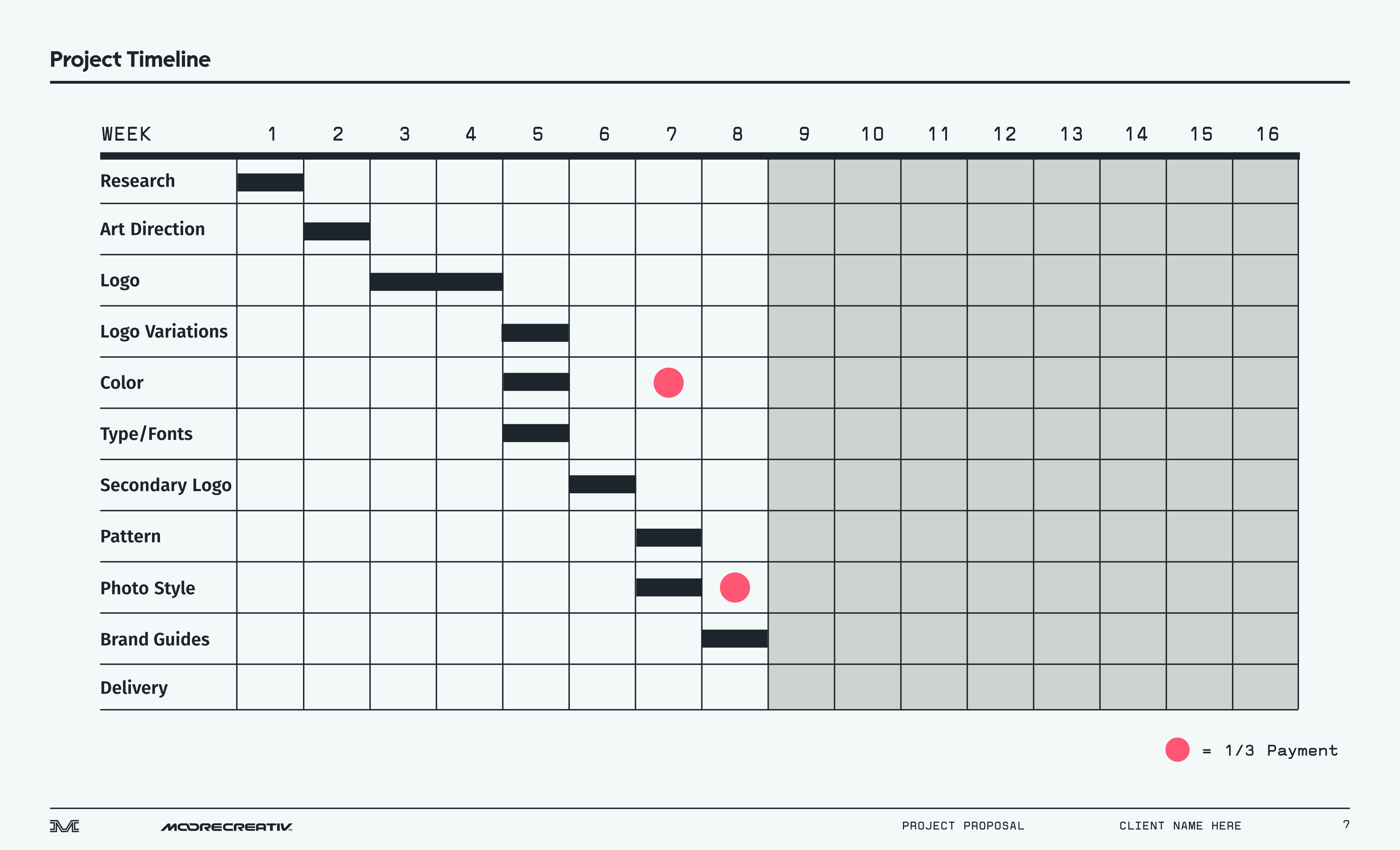
Deliverables
Included in outlines are project quotes or package options with a list of deliverables. Think of the Overview as why we’re doing the project and the Outline as what we’re doing. Proposals expire 30 days from delivery.
2. Kickoff Meeting
Remotely, I prefer doing this with Google Meet but will use whatever virtual meeting platform the client is most comfortable with. For larger projects, it’s best for me to fly to the client and meet face to face while getting the first hand experience of their organization/company. Those site visits are 1-2 days and also provide a lot of inspiration for the project.
Either way, these meetings should be casual as possible. It would actually be more appropriate to call it a kick-off conversation than “meeting”. That sounds so corporate! I want to hear about why the project is important to you and and how everyone defines success. I’ll always have specific questions about the history or vision of the place to dig into as well.
Communication from there is often through email until we need to meet again, and likely with my Project Manager on the chain. She’ll handle most of the non-design business stuff.
Art Direction And… The Death Of Moodboards?
This is usually the point where moodboards are developed and presented, but I may be done with them. They have been useful for me in some ways, but often run into problems with clients understanding the purpose. Sometimes clients see things differently than designers and develop their own expectations that don’t match. I believe this is because graphic designers have a standard practice of being too abstract with moodboards. If you look how architects or interior designers make them, they pull samples of actual materials and colors they intend to use. Graphic designers are not taught that. Instead, we build a vibe and ask the client to imagine something like it but different. It doesn’t make sense.
Moodboards are also time-consuming. I once spent a month working on 3 of them which just felt like such a waste of time.
Another issue is feeling tied to them. Moodboards set up an expectation that everything I design will be pulled from them — all design must be tied back to the moodboard because that’s what the client is buying into. “This doesn’t look like the moodboard” is a sign something has gone wrong, or for the case I’m making, wrong with the process.
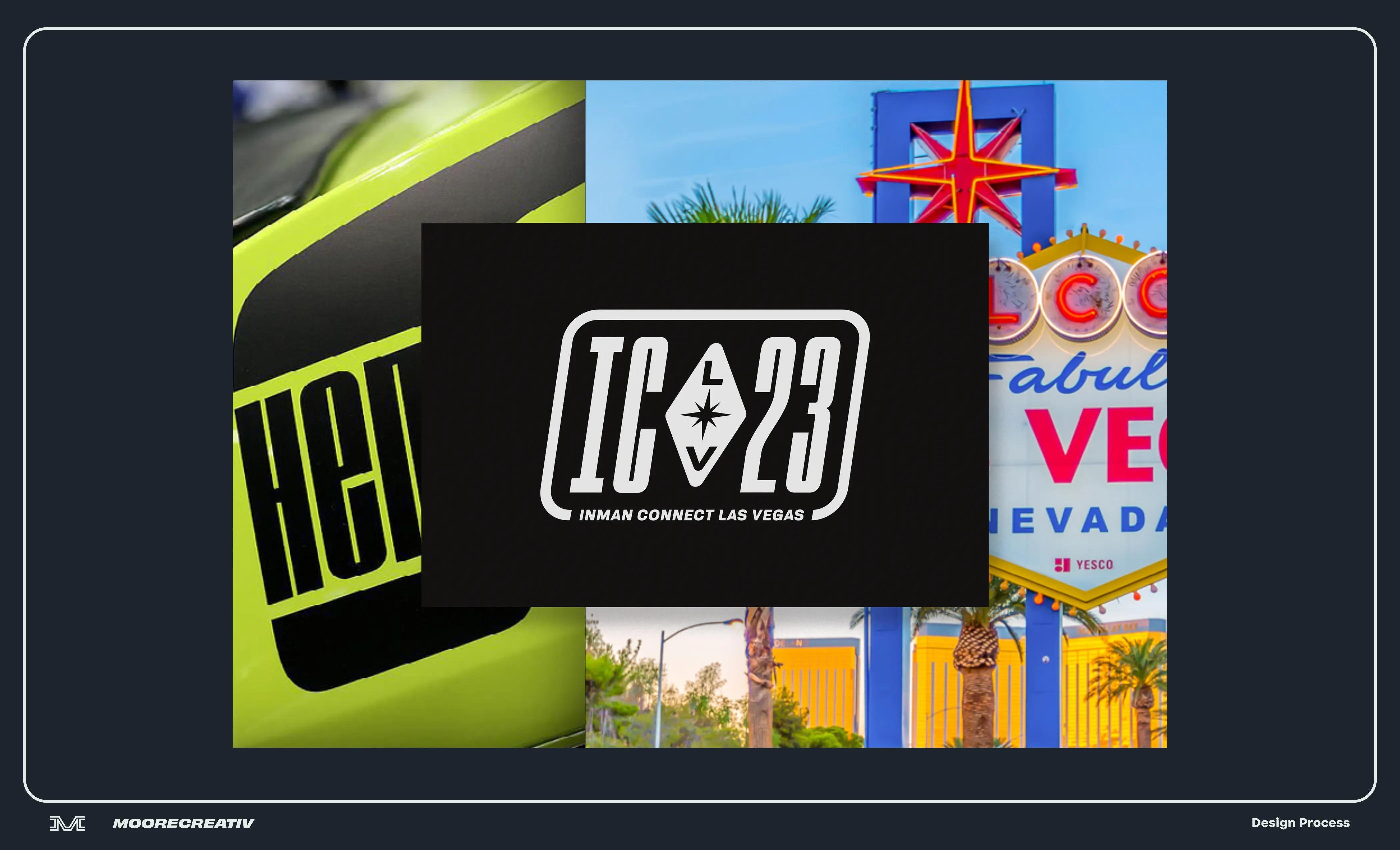
It doesn’t leave enough room for creative left turns, development, and originality. Again, good for interior designers—not graphic designers. I do like how the moodboard came out for ICLV23 (above) and can see it being a helpful part of process, but keeping it for myself on most projects.
3. Concept-Driven Design
Rather than developing moodboards, I’d rather develop narrative concepts. Then explore the concept with parts I intend to use or develop further. In my process, a concept means words (descriptors, physical qualities, a short story, etc) distilled into visual elements. Many times the concept stems from the product or business name.
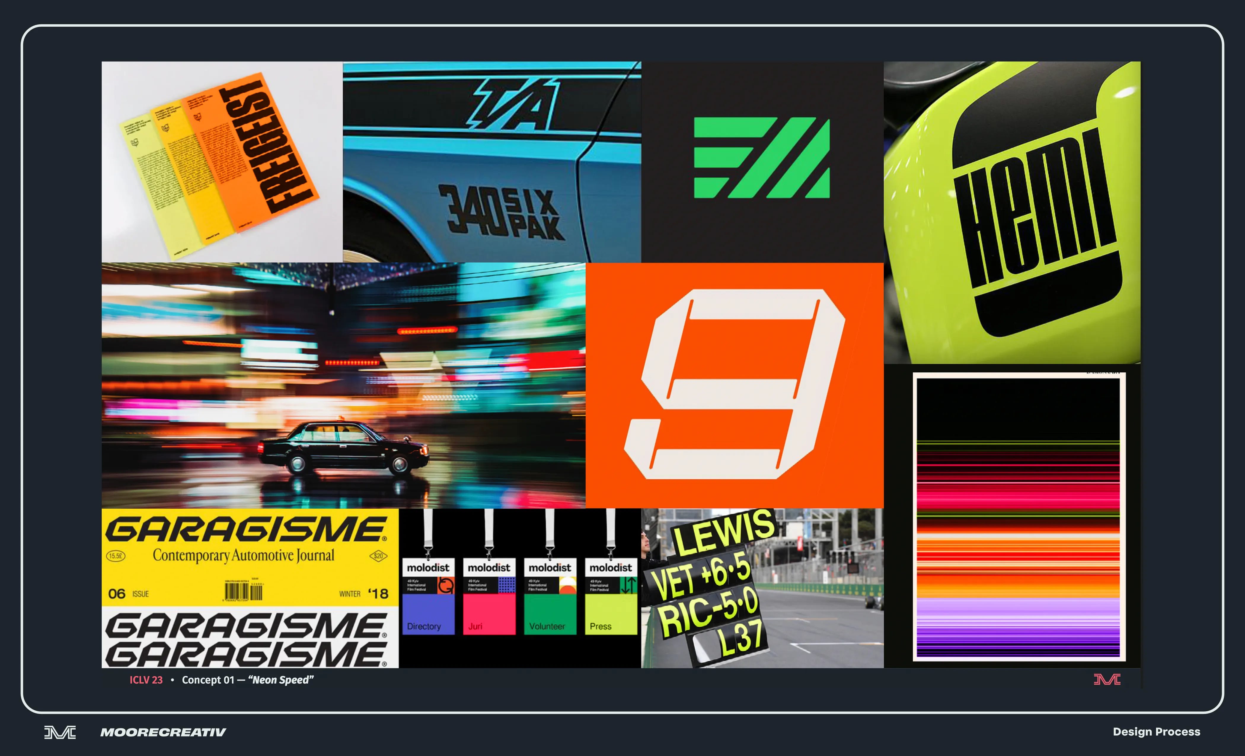
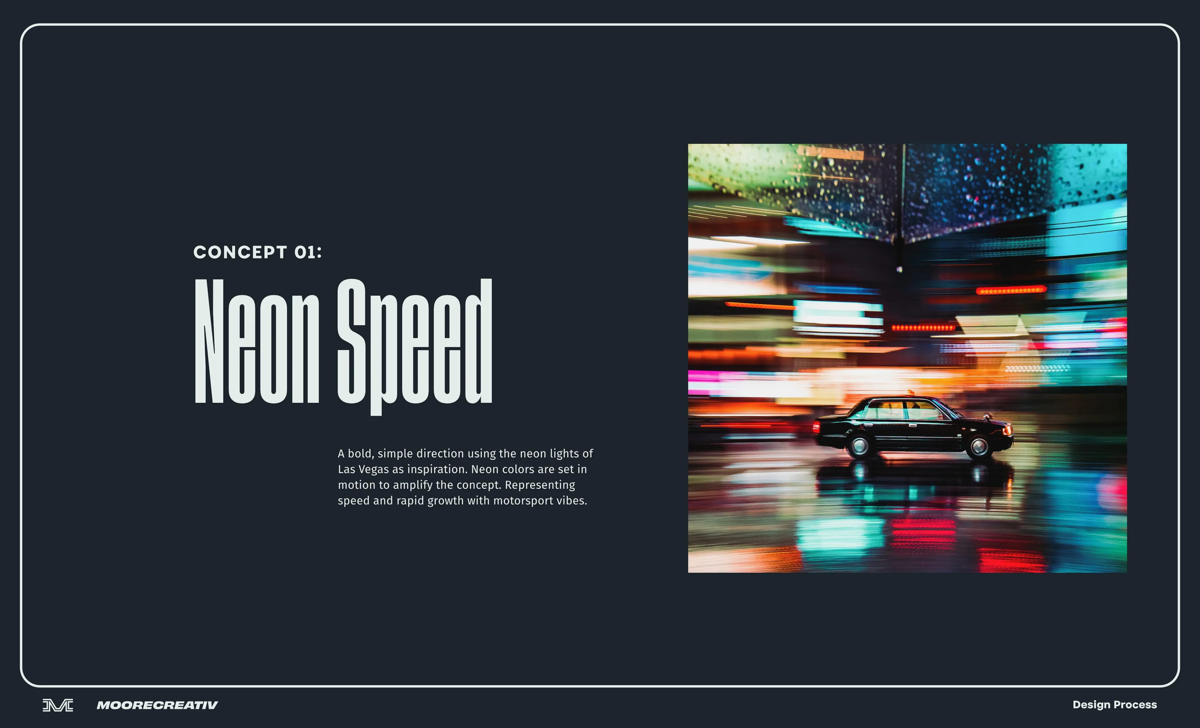
Using Inman Connect Las Vegas as an example, the “Neon Speed” concept started with the client’s request to do a simple, bold motorsports kind of take for their brand identity. They had an idea of how they wanted it to look and good reason for it, representing a fast paced real estate market. I just needed a way to tie that into the event’s host city and find reason for every design decision from there. The event would also be timely, a couple months ahead of the 2023 Las Vegas Grand Prix.
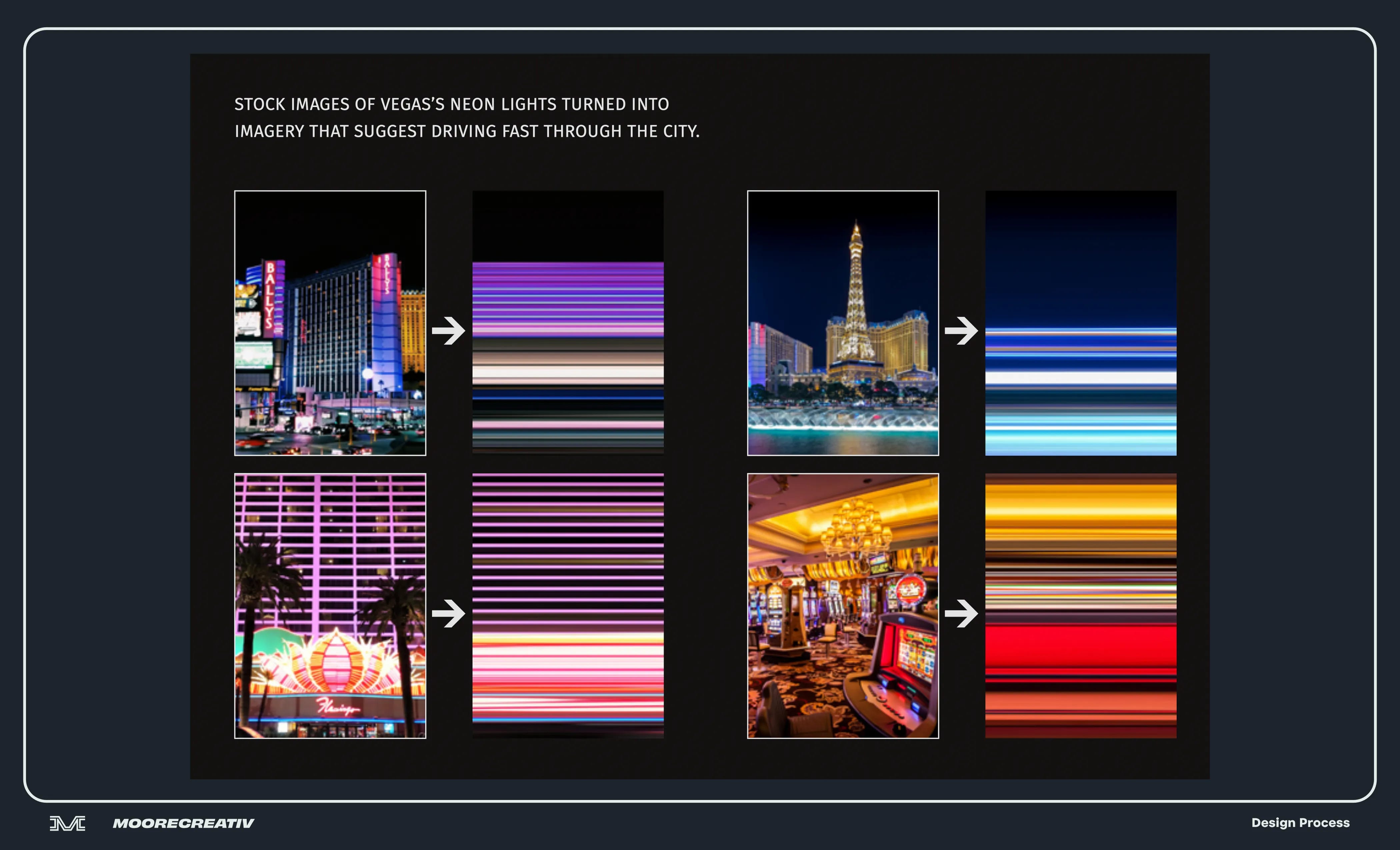
In developing the concept, I thought about how often neon lights are used in Vegas identities. It’s a well of inspiration that seems to be running dry. But I was still intrigued and believed there has to be a way to use neon lights in a new way.
I thought about what I might see if I drove down the Vegas strip at night in a race car. Everything would be blurred. There would be blurred lines of neon. I thought that was a start and we could amplify the neon angle by using neon colors, especially in print.
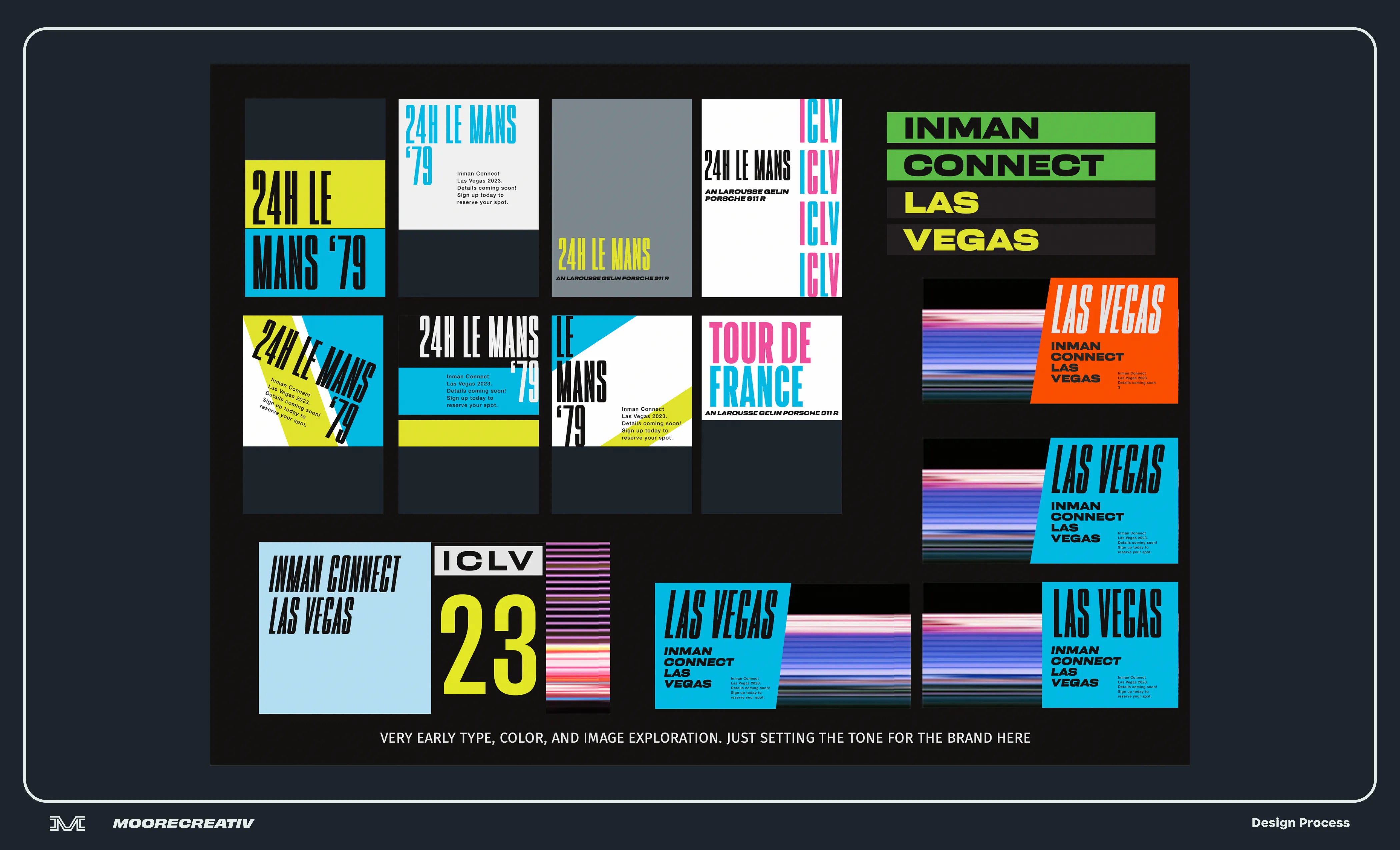
4. Design Options: Type, Color, and Image
The traditional way of developing brand identity is to start with a logo. Maybe it’s in black and white and the next step is to choose color, then type, then images, and so on. I think this is the wrong way to go about it. I find it best to start wide and work my way into detail. Color, photography, and type are the foundation of a brand identity so its often best to start there.
The slide above is also from the ICLV23 project. I had the concept and some ideas about how to pull it off with help of reference images. I needed to explore how this identity might begin to come together in context. I pulled neon color swatches and used them with a few “neon speed” images I created while also exploring font options.
This sort of exploration I find is better than moodboards. Clients can now see exact ingredients being considered and how the concept is starting to come to life. I will do an exploration similar to the above for each number of concepts we agree to.
Important Note: I often use fonts that will need licensing. I highly recommend using high quality fonts and licensing fees are well worth it for most brands. There is always the option to find something similar that doesn’t require licensing, but fonts are like furniture. Two pieces might look similar from afar, but one could be of high crafted quality, the other cheap and shoddy.
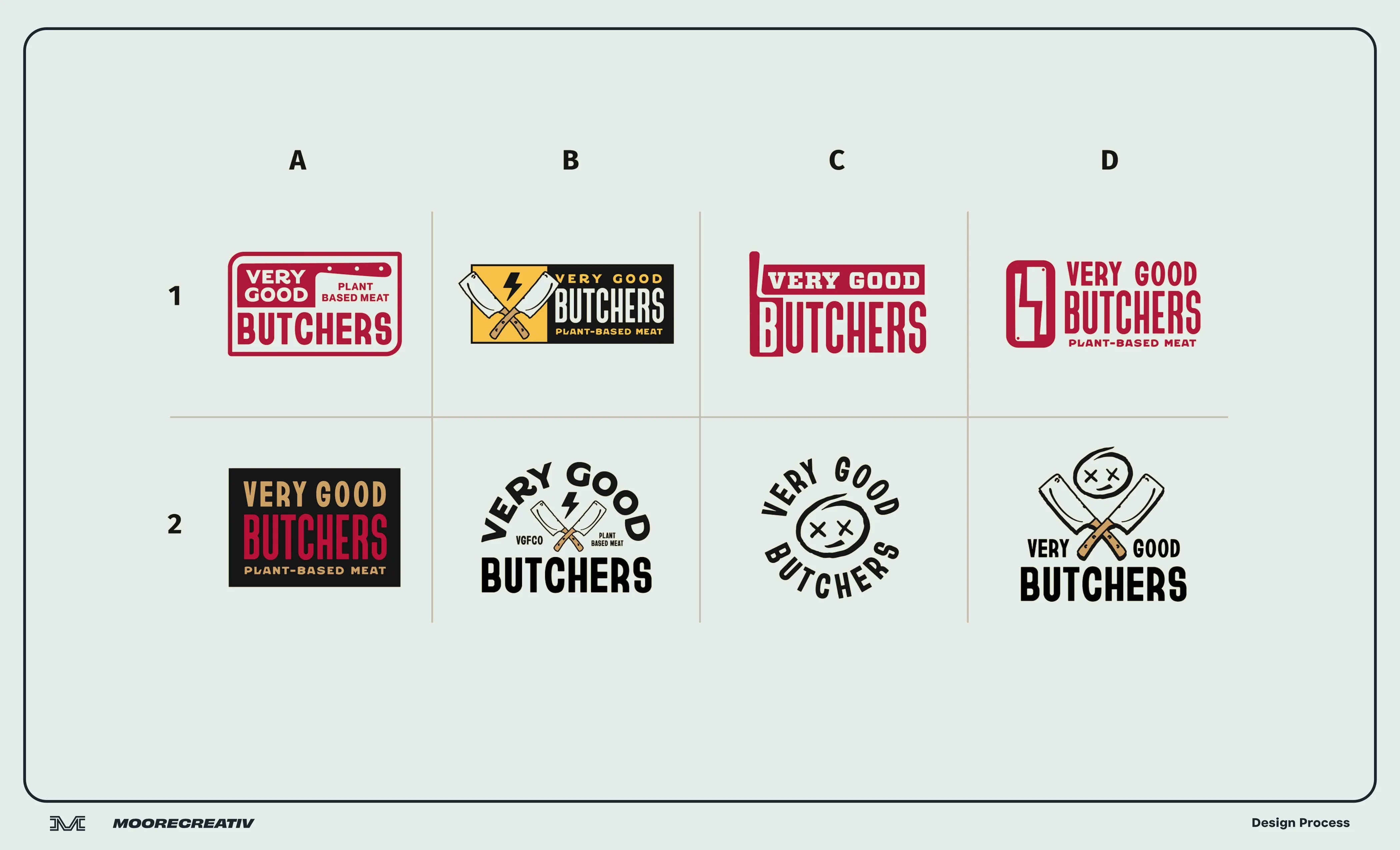
Logo Design
Typical logo and identity projects include 3 logo options. I’ll present each one in context using relevant mockups. It’s always best to see how logos will live in the real world, not just on a black or white background.
But if the project calls for exploring a lot of options, then in the interest of time, I’ll present them next to one another on a page until we can narrow them down to a few. Whether it’s 2 or 10 options, I want each one I present to be significantly different from the other. You shouldn’t have to look too hard to find the differences. Any minor alterations created in the process fall on the designer to cull the best. If we’re making multiple logos (a secondary or wordmark) those will follow a similar process. Development for those begin after the primary logo is chosen and approved.
5. Option Refinement
Don’t panic if you don’t like what you see on round one. Live with it for a few days, get others’ opinions on it, and let’s regroup to continue the process. I would wager 99% of good design is a result of an evolving idea being crafted over time.
I put it on myself to always show the best work I’m capable of showing so we don’t have an endless loop of revisions. However, revision caps are important. The standard cap is 3 rounds. No one wants to spend months on revisions. Everyone loses energy for the project and feedback sometimes isn’t focused. Having a set number of revision rounds gets everyone involved to think hard about the next decisions and steps. It also emphasizes the importance of concept and all the work we do early on. If we start with good ingredients, we have a better chance of making a good dish at the end.
6. Delivery
Before I deliver anything, I’ll spend a day or two making final adjustments that you probably won’t notice or care about, but it will bug me if I don’t fine-tune it. Once all the deliverable items are approved, I’ll deliver all the files you need. Typically for logos, its vector (EPS, for print) and raster (JPG and PNG, for web) files. Copyright for the work transfers to you with permission for me to display and promote it.
Also, I now offer brand guides as an online option with Standards.site which I highly recommend over a PDF.
—
I want all my clients to know I don’t disappear after the project is done! If there is ever a small mistake I didn’t catch or a file that needs updating, I can likely remedy that quickly. Some have asked if they have to pay additional fees for those sort of things— you do not.
I also love to hear how people are using my design and if it’s working for them. Please let me know how the identity is performing on your end or any other questions you have at all. Hopefully, we’ll connect again on another project.